
Tuesday, August 14, 2012
Friday, April 27, 2012
My hardest assignment this semester...

Remote Sensing
In our final lab we were required to use a software called MultiSpec. is a processing system for interactively analyzing Earth observational multispectral image data such as that produced by the Landsat series of Earth satellites and hyperspectral image data from current and future airborne and spaceborne systems such as AVIRIS. The primary objective of MultiSpec is as an aid to export the results of our research into devising good methods for analyzing such hyperspectral image data.
Question 10.8 Why are the areas between the runways red?
Question 10.8 Why are the areas between the runways red?
- In this lab, we were required to use a 4-3-2 combination. This means that band 4 was red.
- Just like the previous question, we were asked to use a combination of 3-4-2. We manually set band 4 to green, this is why it appears this way.
- We were now asked to set the color configuration to a 3-2-4. Band 4 is now represented by the color blue.
Thursday, April 12, 2012
Interactive Map
The interactive map that I created is of my hometown, Monroe, Michigan. I chose to pinpoint all of the schools in the Jefferson District, the district I attended my entire life. You can zoom in and out or search for the school in the district using the search bar located at the top of my map. You can also change the basemap if you like.
Creating this map was so easy and fun. ArcGIS seems to have limitless applications in the real world, and I am excited to continue using the software in the future!
View Larger Map
Creating this map was so easy and fun. ArcGIS seems to have limitless applications in the real world, and I am excited to continue using the software in the future!
View Larger Map
Population Density Maps
The first map that I uploaded is my Choroplethic Map of Michigan. According to the legend, it looks like the population of Michigan is much higher in the southeastern section of the state. Also, the upper peninsula appears to have a much smaller population density than the lower peninsula. Wayne County, which is hard to read because the font is a little small, has the largest population in the state.

The next map I created was the Dot Density map of Michigan. It gives us similar information as the Choroplethic Map, but it is displayed in a different manner.

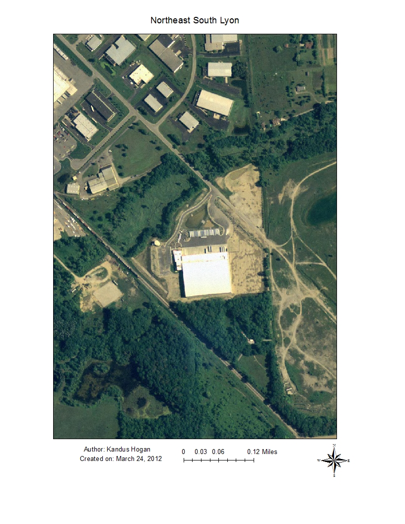
Saturday, March 24, 2012
Spatial Analysis

What cities had a population of 25,000 or more.
All the roads that intersect with SC.
The states that touch SC.


Saturday, February 11, 2012
Intro to GPS
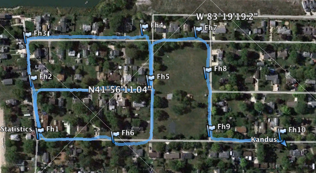
Well, to begin this blog I have to say how awkward I felt driving around my neighborhood, stopping at every fire hydrant, and tracking the coordinates. You know how someitmes you sit in your living room and you see a "creeper" driving up and down your streets and you think, "What the heck is this guy up to?" I was that creepy person today ;).
On that note, I actually had a lot of fun doing this. I used my Android phone, with the MyTracks application. I was able to share "with friends" right from the application to GE as a KML file. It was SUPER easy, and very interesting.
In my image, you can see that my coordinates are located in the 41N / 83W with varying minutes and seconds. I labeled each hydrant as FH1-FH10. MyTracks also allows you to add notes to each marker, and that is where I chose to keep my thoughts on the condition of each hydrant.
To sum up, this lab on paper was very intimidating. Once I got out and mapped the coordinates I really surprised myself at how much fun I actually had.
Wednesday, February 1, 2012
Conic Projections
I chose to do research on Conic Projections. After a few minutes of research I came across Polyconic Projections and I was very intrigued. As we learned in the lecture, conic projections show one or two parallels where the conic and spherical surfaces coincide. The best way to describe a polyclinic projection without using a photo can be found at www.progonos.com, "Cone constant varies from one at poles to infinity at the Equator, so the strips are not continuous, except along the central meridian. When infinitely many cones are used, each optimally tangent to a thin strip containing a single parallel, the gaps disappear; if the central meridian has constant correct scale, the result is the classic or common polyconic projection, also called American polyclinic."
Below are images of the two:
Conic


Below are images of the two:
Conic
Polyconic or American Polyconic
To sum up, the simplicity of the conic map is what first caught my attention. I had one of those "why didn't I think of that?" moments. Then I realized this form of map projection was perfected in the 1820's, and I'm a few hundred years behind. Regardless, conic map projections have proved to be very useful and are still used today.
Tuesday, January 17, 2012
Google Earth Intro
The Google Earth lab was surprisingly very interesting. I have used in before, but never really used many of the features the lab called for. My favorite features were:
- Pseudo 3D imagery
- When I was looking at Mt. Rushmore, I thought it was really cool that I could turn the 3D image on and see all of the President's faces. I could then turn it back off and you wouldn't even know that there was a monument there.
- Route Tour
- I also really enjoyed the route feature. Next time I plan a trip I think I will use the route option because it really gives you a good idea of the type of terrain you are about to encounter.
Subscribe to:
Posts (Atom)