
Tuesday, August 14, 2012
Friday, April 27, 2012
My hardest assignment this semester...

Remote Sensing
In our final lab we were required to use a software called MultiSpec. is a processing system for interactively analyzing Earth observational multispectral image data such as that produced by the Landsat series of Earth satellites and hyperspectral image data from current and future airborne and spaceborne systems such as AVIRIS. The primary objective of MultiSpec is as an aid to export the results of our research into devising good methods for analyzing such hyperspectral image data.
Question 10.8 Why are the areas between the runways red?
Question 10.8 Why are the areas between the runways red?
- In this lab, we were required to use a 4-3-2 combination. This means that band 4 was red.
- Just like the previous question, we were asked to use a combination of 3-4-2. We manually set band 4 to green, this is why it appears this way.
- We were now asked to set the color configuration to a 3-2-4. Band 4 is now represented by the color blue.
Thursday, April 12, 2012
Interactive Map
The interactive map that I created is of my hometown, Monroe, Michigan. I chose to pinpoint all of the schools in the Jefferson District, the district I attended my entire life. You can zoom in and out or search for the school in the district using the search bar located at the top of my map. You can also change the basemap if you like.
Creating this map was so easy and fun. ArcGIS seems to have limitless applications in the real world, and I am excited to continue using the software in the future!
View Larger Map
Creating this map was so easy and fun. ArcGIS seems to have limitless applications in the real world, and I am excited to continue using the software in the future!
View Larger Map
Population Density Maps
The first map that I uploaded is my Choroplethic Map of Michigan. According to the legend, it looks like the population of Michigan is much higher in the southeastern section of the state. Also, the upper peninsula appears to have a much smaller population density than the lower peninsula. Wayne County, which is hard to read because the font is a little small, has the largest population in the state.

The next map I created was the Dot Density map of Michigan. It gives us similar information as the Choroplethic Map, but it is displayed in a different manner.

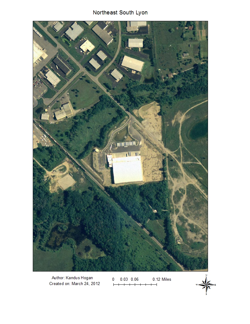
Saturday, March 24, 2012
Spatial Analysis

What cities had a population of 25,000 or more.
All the roads that intersect with SC.
The states that touch SC.


Subscribe to:
Posts (Atom)